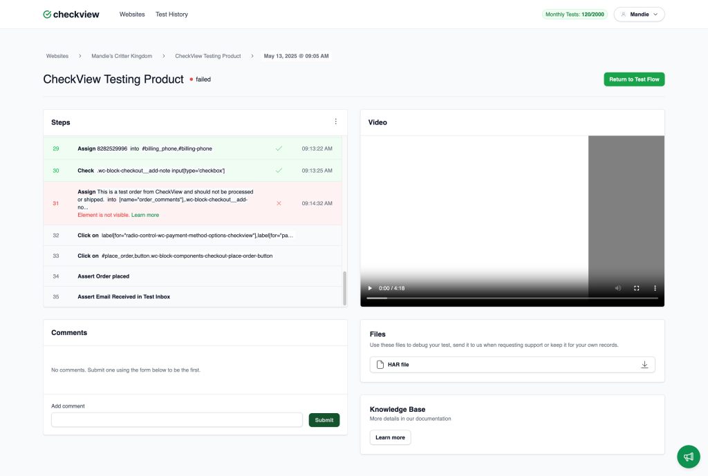
After running a test in CheckView, you can see the results on the individual test results page, which provides a complete breakdown of what occurred during the test. This page helps you quickly identify what passed, failed, or requires further review.
Test Metadata Section
Located at the top of the page, this section shows:
Test Name: Title of the test suite (e.g., CheckView Testing Product).
Status: The colored dot and label (e.g., 🔴 failed) show whether the test passed, failed, or was aborted.
Timestamp: Date and exact time when the test ran (e.g., May 13, 2025 @ 09:05 AM).
Navigation Path: Breadcrumb links allow you to return to the specific website, test suite, or test history view.
Steps Panel (Left Column)
Displays all actions attempted during the test, including:
Step Number and Description: Each step is numbered and describes what CheckView tried to do (e.g., Assign 8282529996 into #billing_phone).
Selectors and Target Info: The specific CSS or XPath selector used.
Status Icons:
✅ Green check: Step passed successfully.
❌ Red X: Step failed.
⏳ No icon: Step was not executed (e.g., after a failure or abort).
Timestamps: Time when each step was executed.
Failure Details: If a step fails, an error message (e.g., Element is not visible. Learn more) appears directly under the step.
Video Panel (Right Column)
A video recording of the test session allows you to:
Watch exactly what happened during the test.
Pause, skip, and replay actions to visually debug issues.
Time-aligned with the step list for reference.
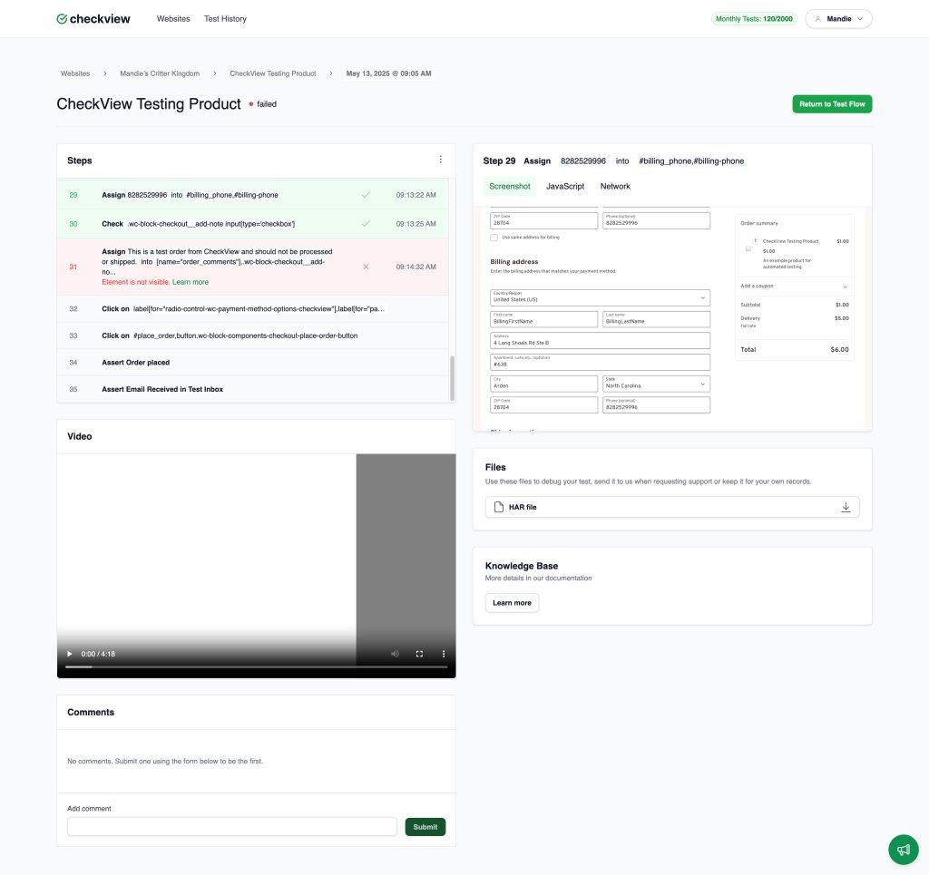
Viewing Details for a Specific Step
When a user clicks on a step from the Steps panel, CheckView expands the right-hand section of the interface to display in-depth diagnostic information for that specific step. This gives users powerful visibility into what happened during that moment of the test.
Step Detail Panel (Right Side): After clicking on a step (e.g., Step 29: Assign 8282529996 into #billing_phone), the right panel dynamically updates to show several tabs of contextual data:
Screenshot Tab: Great for catching visual errors (e.g., modal blocking input, element obscured, or misaligned UI). Shows a full-page screenshot captured immediately after the step was executed. Highlights the targeted element, helping users confirm that the selector was correct and the field or element was present and visible.
JavaScript Tab: Displays JavaScript console logs captured at the time of the step (not shown in the screenshot but typically available). Useful for detecting errors like Uncaught TypeError, validation failures, or script blocking issues that may not be obvious visually.
Network Tab: Shows a breakdown of network requests relevant to that step with downloadable log responses. Useful for debugging form submissions, AJAX activity, or payment gateway responses.
Comments Section
Located below the step panel:
Add Comment Box: Users can leave notes, questions, or context about the test run.
Shared Thread: Collaborators can view and respond to comments for troubleshooting or documentation purposes.
Files Panel
Provides downloadable artifacts to assist with debugging:
Network Log (HAR): A capture of the network activity during the test. This can help diagnose requests, responses, and load times. More details on using Network Log (HAR)s for debugging are here.