Understanding the UX Audit Report
This guide explains how to read and interpret a CheckView UX/CRO Audit Report. For creating audits, see UX/CRO Audit Reports .
Report Structure
Each report contains three main sections:
Site Overview – A high-level summary of your site’s UX postureExecutive Summary – The biggest conversion opportunities in 1-2 sentencesDetailed Findings – Individual finding cards with specific issues and recommendations
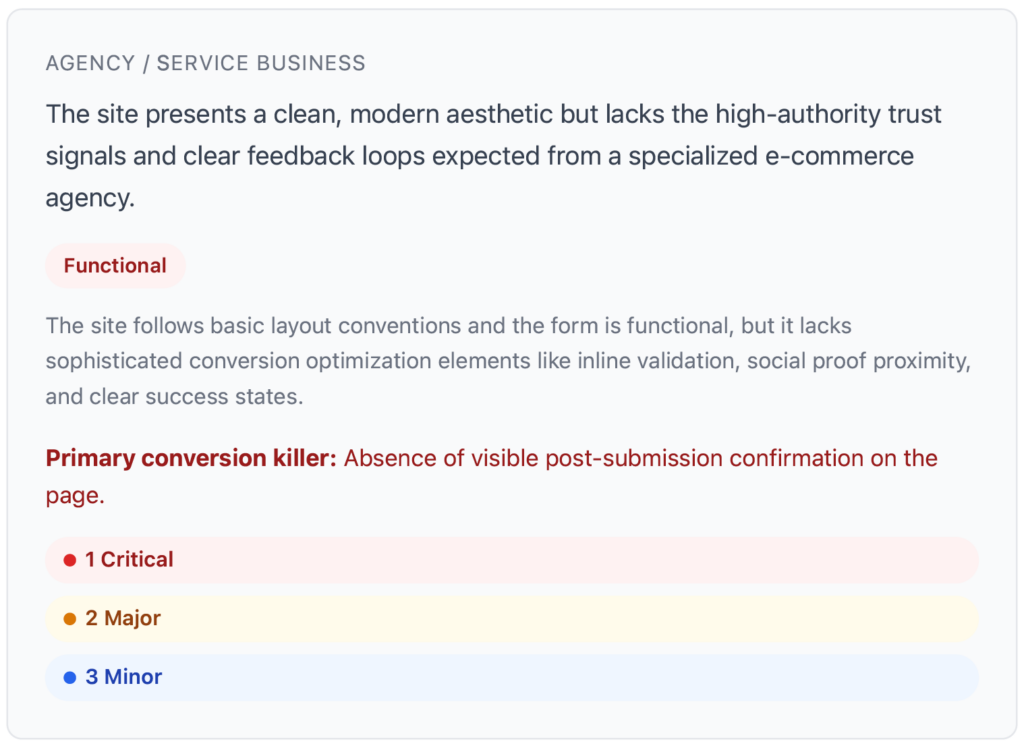
Site Overview Card
The Site Overview card at the top of the report includes:
Site Type – Auto-detected category (e.g., E-commerce, Lead Generation, Service Business)UX Maturity Badge – One of three levels:
Functional – The site works but has significant UX gapsCompetitive – Solid UX with room for optimizationOptimized – Strong UX following current best practices
Overall Impression – A brief summary of the site’s UX and conversion potentialPrimary Conversion Killer – The single biggest thematic weakness identified across all pagesFinding Summary – Count of findings by severity (Critical, Major, Minor, Suggestion)
Severity Levels
Each finding is assigned a severity level:
Critical (red) – Blocks or severely impedes conversion. Examples: unreadable text, broken form, invisible CTA.Major (orange) – Significant friction or confusion but doesn’t fully block the flow. Examples: poor contrast, confusing labels.Minor (blue) – Cosmetic issue with limited conversion impact.Suggestion (purple) – Optimization opportunity or A/B test idea.
Finding Cards
Each finding is presented as a card with:
Screenshot – A thumbnail of the relevant page area. Click to enlarge in a modal view.Category – A color-coded label indicating the type of issue (see categories below)Severity Badge – Critical, Major, Minor, or SuggestionTitle – A short, action-oriented directive (e.g., “Increase CTA button contrast”)Business Impact Tags – 1-2 tags indicating the expected business impactThe Issue – 2-3 sentences explaining what’s wrong and why it hurts conversionsRecommendation – 2-3 sentences with specific, implementable fixes (colors, sizes, copy changes, placement)
Finding Categories
Findings are organized into 11 categories:
Form Design
CTA Design
Navigation
Trust & Credibility
Page Layout
Content Hierarchy
Value Proposition
Mobile UX
Accessibility
Visual Design
Header & Footer
Business Impact Tags
Each finding includes 1-2 tags from this list:
Increase Form Completions
Reduce Bounce Rate
Build Trust
Improve Scannability
Reduce Friction
Increase Engagement
Improve Accessibility
Strengthen Brand
Downloading the Report
Click the Download PDF button at the top of the report to save it. This opens your browser’s print dialog – choose “Save as PDF” to download. The exported PDF preserves all finding cards, screenshots, and styling.
WooCommerce Test Products
If your audit includes WooCommerce test flows, the AI automatically recognizes CheckView’s test product ($1.00 pricing, placeholder images) and excludes it from UX criticism. You won’t see findings about the test product’s pricing or images.
Related Articles